Laffs is Tucson’s premier comedy club. This was my first real freelance project, one I turned into a decade-and-a-half collaboration.
Here’s how it evolved:
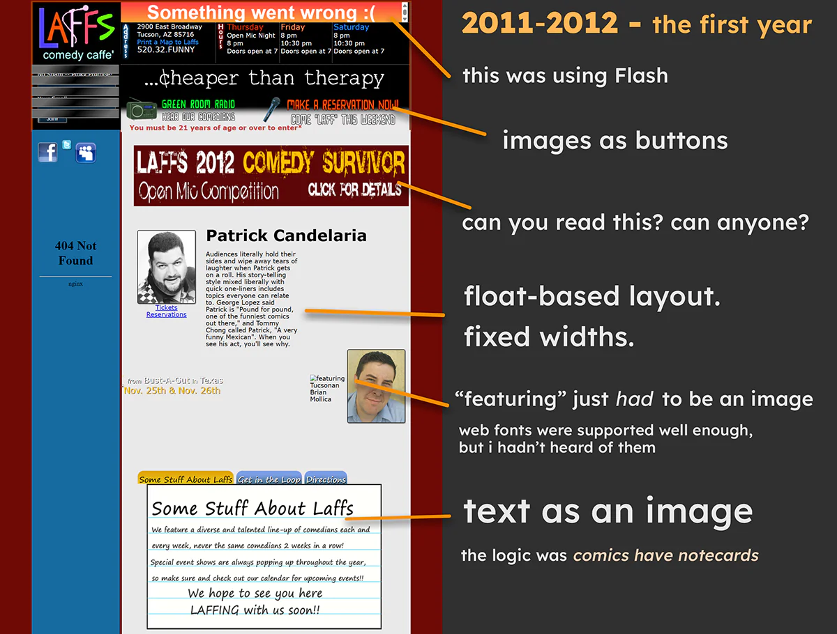
Well, I had to start somewhere.
I was fresh from getting a certificate in Web Design from Rio Salado College (after a BA in Journalism from Arizona I didn’t want to use)
I had energy, drive, and not nearly enough skills.
Accessibility? Hadn’t heard of it yet. Responsive? I didn’t know that was a thing. I didn’t even have a smartphone yet.
And yet, it converted; tickets and reservations continued to flow.
Ugly but functional.
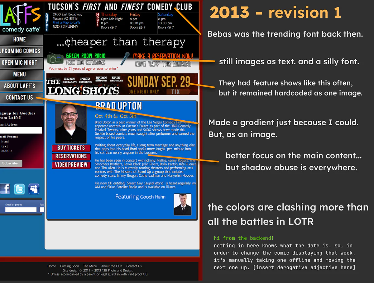
It was a measurable improvement in design. Maybe on the Planck scale, but measurable.
There was more of an order to elements.
The most important content was accentuated -- poorly with blue, bad contrast and font size -- but it was made clear.
That component in the sidebar to sign up for emails, it used a long-since-abandoned method of selecting what kind of email to send. (It was third-party)
Wasn’t responsive, accessible, or attractive. Conversions continued, but it wasn’t near professional yet.
At this point it should be mentioned that I built this site with help from a coworker well-versed in PHP. I was learning it, but far from ready to manage a custom CMS.
I abruptly lost the job I worked with him at. I never heard from him again. So here I am with a PHP 5 CMS that he wrote and no docs exist.
It’s said immersion is the best way to learn a new language. Seems to apply to coding too.
Thank you, Stack Overflow.
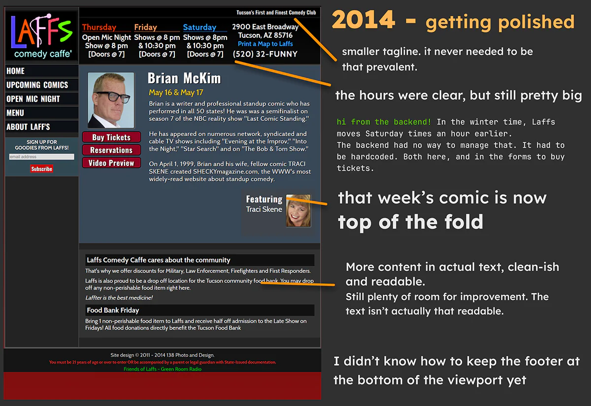
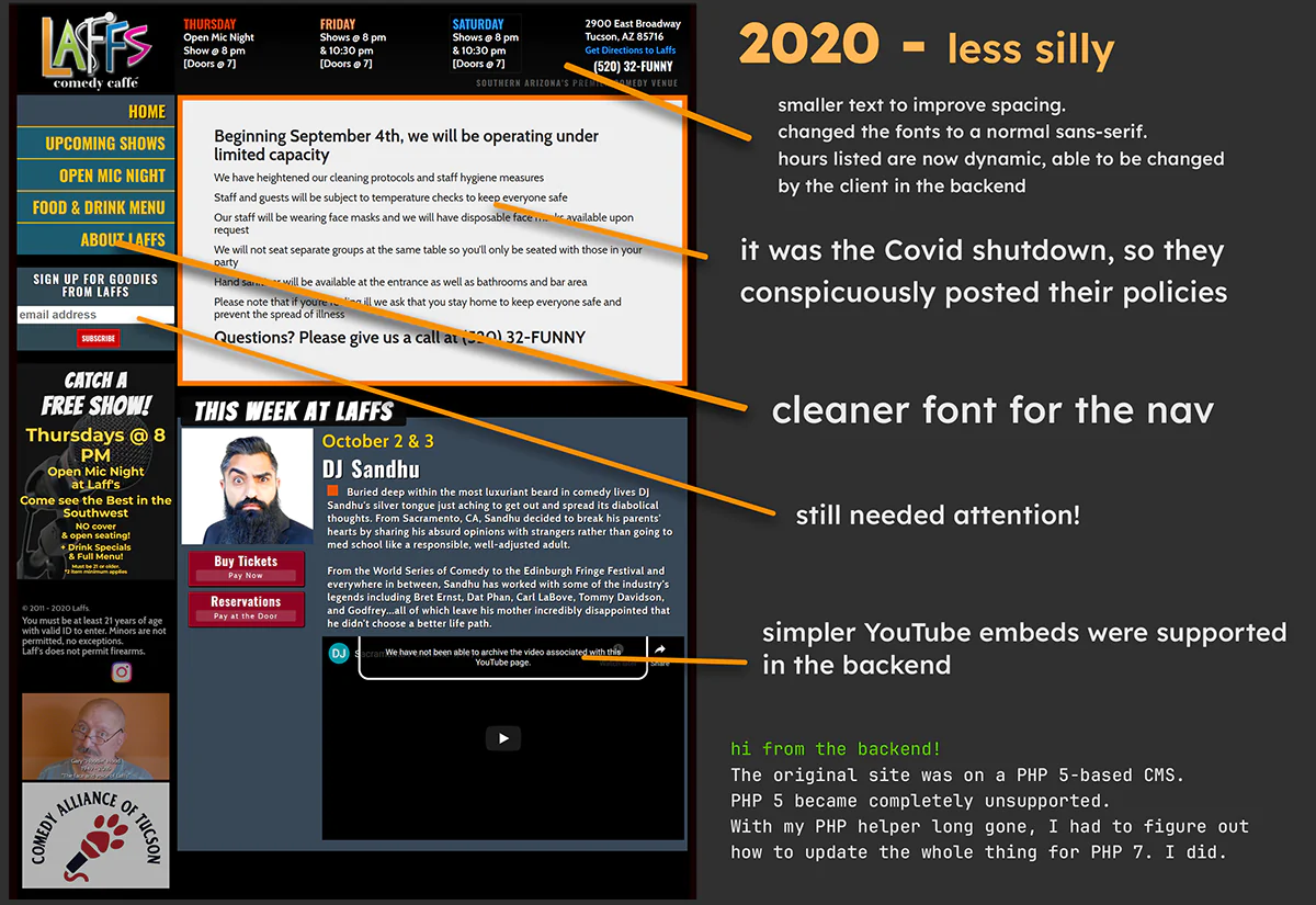
The site is seeing less fluff and more to the point content.
Signing up for emails in the sidebar is down to one input. It’s not styled well, but it’s coming from Mail Chimp, so options were limited.
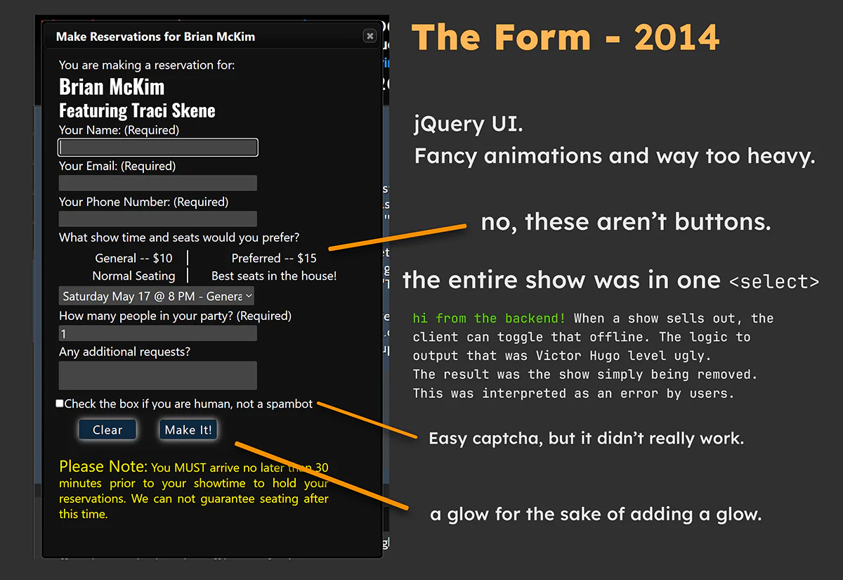
The forms to make a reservation and buy tickets are the most crucial elements on the site. They didn’t get much attention from me though. Too much focus on making them open in fancy ways, little focus on making it easy to use.
It didn’t change much as the rest of the front end moved on.
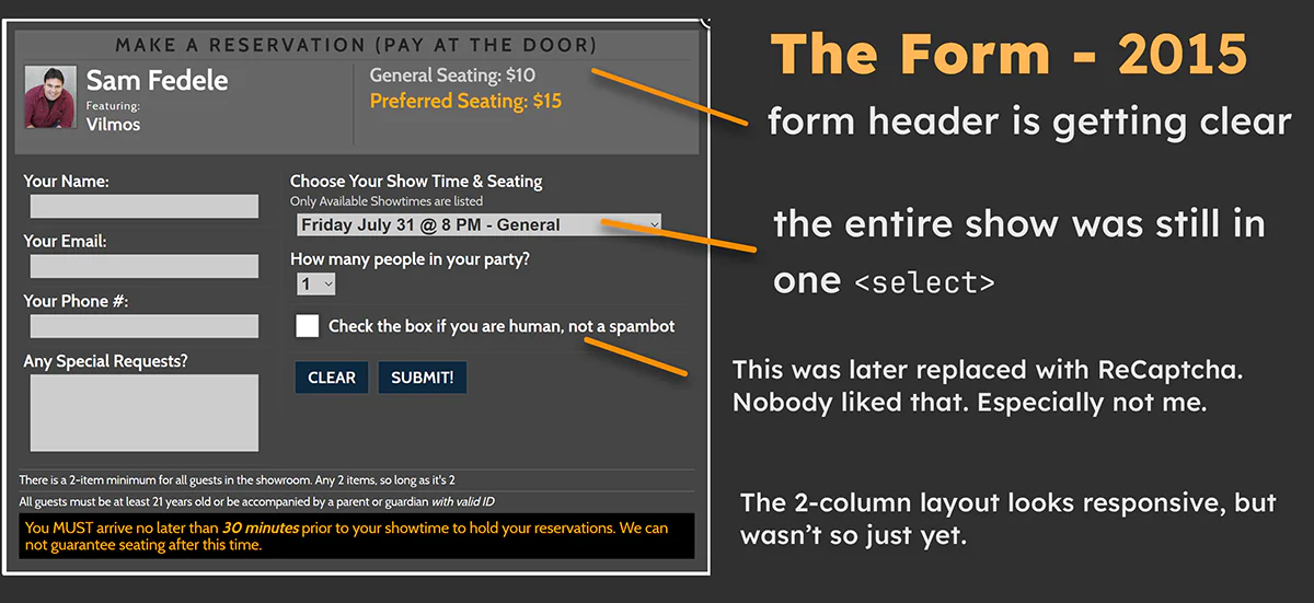
The forms got a huge renovation. The form header was clear - making a reservation that pays at the door (as opposed to tickets, which pay now). The comic headlining, and the seat prices. The prices don’t look like selectable form elements anymore.
Still couldn’t get past using one dropdown for the whole thing show date, showtime, and seating type. But I added that label "only available showtimes are listed" to attempt to clarify why some might be missing.
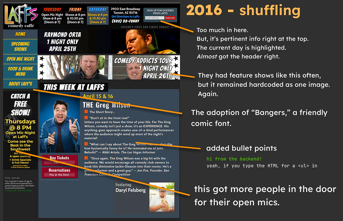
Things moved around more, but they were still pretty tightly packed.
Fonts began to slim down to a specific set. A sidebar component was added to increase traffic for their Open Mic night.
The overall layout remained similar, so users wouldn’t be shocked with an all new way to navigate what they already know.
SEO at this point had Laffs at the top of Google, for terms like ‘tucson comedy’
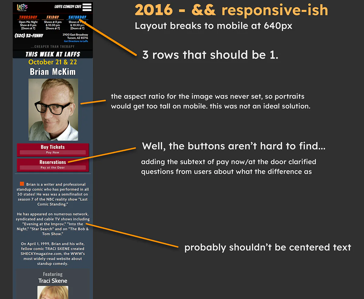
Finally, mobile users aren’t out of luck. Breakpoints were added to make it responsive.
Still wasn’t using any Flexbox, so these were float-based mobile styles. Not pretty, but functional.
Color use is still somewhat random. The client did request several colors.I was able to slim down the overly broad spectrum we started with.
The site is about 5 years old at this point and taking some shape.
There was no need to spread the comic font around everywhere. “Bangers” was pulled from pertinent info, such as the hours and the navigation.
Responsiveness improved.
The backend was improved as well. By improved, I mean fully rewritten. Very little was salvageable from the original code, so all functionality had to be redone.
I introduced the framework UIKit to simplify developing the admin interface. Database connections were upgraded to more secure methods. All of it was learning PHP on the fly.
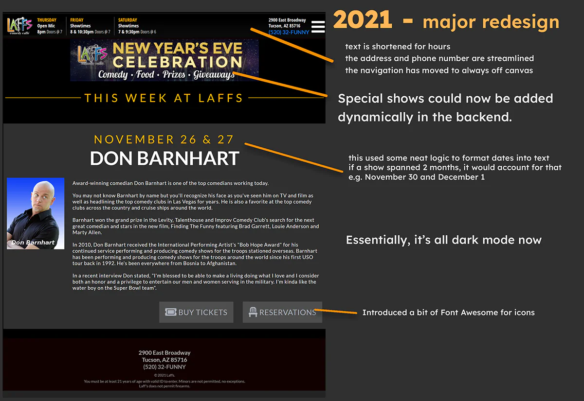
The first major redesign.
I added UI Kit to the frontend as well. jQuery UI was completely gone by this point.
Everything was faster. No animations for the sake of animations (See: jQuery UI Explode)
The sidebar went away, making mobile use even simpler.Colors were reduced, more elements adopted a dark mode.
Simplicity was coming into focus.
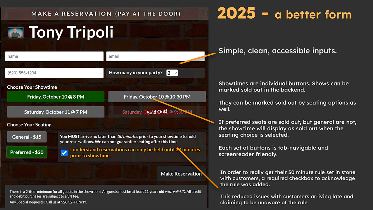
Welcome to the usable form.
No more single dropdown for every possible show combination. Users can now select their show and seating independently. If a showtime and/or seating is sold out (toggled in the backend), buttons will disable and be labeled accordingly.
All recaptcha has been removed. The form now uses custom filters, an IP blocker, and geofencing to prevent spam. IP addresses can be added to the blocked list directly from the emails sent to the client via the forms.
The textarea for special requests was removed. It was rarely used by customers, and was the hottest target for spam. That also cleared up valuable space.
Screenshots are from the Wayback Machine; some assets may not have loaded.